But (to my sorrow) we're not studying War of the Worlds in my Coursera course, so I found some more relevant illustrations. We're passing out of the Golden Age of the illustrators, so many of these are from book covers or film posters.
The Island of Dr Moreau
We're moving into hard SF territory here, so the illustrations are overwhelmingly of the "pulp" variety. Some of them are nonetheless amazing: this site rounds up a few.This one has a *Boys Own Adventure* feel, which I suppose is one way of looking at the narrative:

I love how all-inclusive it is: the artist seems to have tried to depict every single one of the Beast People. They all look more like animals than I imagined when I read the book. That might be the easier path for an artist - it must be difficult to draw them as they are described by Wells, where more subtle lines of the jaw and forehead hint at the creatures' origins, than to draw these beast-headed men.
This next one is interesting, because it reminds me of the scene in Frankenstein where the creature confronts his reflection for the first time:

This is the poster to the 1977 film version, starring Michael York and Burt Lancaster:

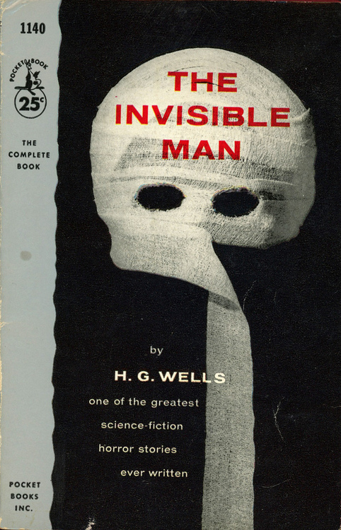
The Invisible Man
Quite a challenge to an artist! Here's Andrei Goncharov's beautiful 1954 illustration of the opening scene:
I like how he captures a watchfulness in Griffin's face, despite the fact there's no actual face there.
Here's a pulp novel cover: we're moving towards the classic Invisible Man image here:
Some short stories
Here's an 1897 illustration for "The Star", by Luděk Marold:

English illustrator Clifford Webb did some amazing Art Deco illustrations for "The Country of the Blind":


These are great. I really need to read more about Art Deco, because the biggest association this is setting off in my mind is "Bioshock" (good) and Ayn Rand (VERY bad). There's a copy of this edition going on ebay for a mere 372 euros, if anyone's interested.
And finally, this is what's hanging on the wall behind me as I write this:

No comments:
Post a Comment